


Pantone Colour Of The Year 2022
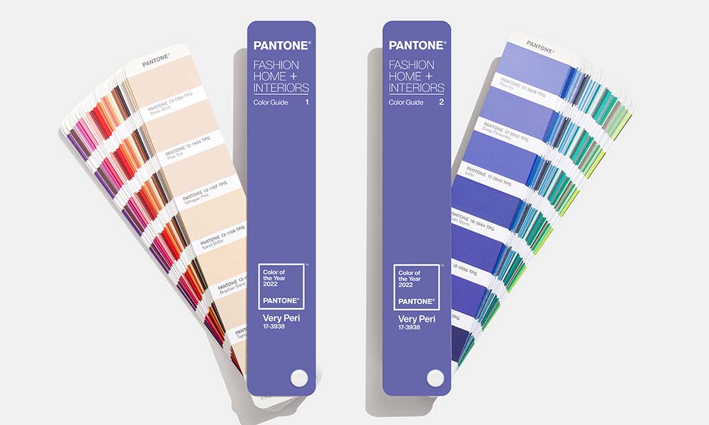
Drumroll, please... Pantone's colour of the year 2022 has finally been revealed as 'Very Peri', a warm blue with calming violet-red undertones that encourages personal inventiveness and creativity. A unique colour that’s like no other.
Pantone’s executive director, Leatrice Eiseman, said, "As we move into a world of unprecedented change, the selection of PANTONE 17-3938 Very Peri brings a novel perspective and vision of the trusted and beloved blue colour family".
For the first time in History, Pantone has created a brand-new colour that symbolises transformation, confidence and imagination, as we move into a new year of 'unexpected change'. It's the first time ever for Pantone to create a new shade for its colour of the year, and we have to say we are pretty impressed!
Very Peri Palettes and Our Floors
“Very Peri blends the faithfulness and constancy of blue with the energy and excitement of red to introduce an empowering mix of newness to apparel, beauty, home furnishings, product design, and packaging”. The soft yet vibrant shade of Very Peri works great with a variety of colour palettes matched with our floors. Let’s take a look.
 Credit: Pantone
Pantone’s Wellspring Palette
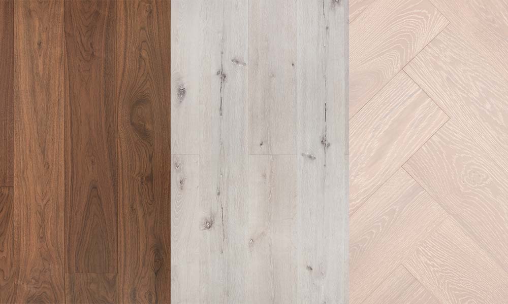
Embrace your inner zen by paring this new shade with nature-infused tones, especially Pantone's 'Eggshell Blue' and 'Green Briar'. Are you looking to adapt this colour palette to your home next year? Our Berkeley Rasin Walnut will look exceptional with this new colour. Just imagine, Very Peri around your walls with a plush, blue velvet armchair next to it, accessorised with green lampshades and fluffy cushions. It will instantly breathe some fresh air into your space.
Pantone’s Star of The Show Palette
If you have an eye for sophistication, take this new colour and match it with neutrals and browns like 'Deep Taupe' and 'Cloud Dancer' to show your stylish side. Pair this colour palette with our Ashen Oak for a luxury feel. This floor will bring out the cool tones of blue hidden within Very Peri that will instantly add style to your home.
Pantone’s Amusements Palette
Play around with playful colours like Pantone's 'Pink Flambe' and 'Yellow Cornsilk' to show carefree confidence in your home. Play around with electric pink decor against our Painswick Seal Oak. The violet tones hidden within this floor will bring out the lavender tones in Very Peri, creating a fun yet modern space. For more colour inspiration, take a look at our blog post on what interior trends are still going strong if you’re thinking of decorating next year!
Previous Years
Let's go back in time and take a look at some of Pantone's previous colours!
- PANTONE 17-5104 Ultimate Gray and PANTONE 13-0647 Illuminating Yellow (2021)
- PANTONE 19-4052 Classic Blue (2020)
- PANTONE 16-1546 Living Coral (2019)
- PANTONE 18-3838 Ultra Violet (2018
- PANTONE 15-0343 Greenery (2017)
- PANTONE 15-3919 Serenity and PANTONE 13-1520 Rose Quartz (2016)
- PANTONE 18-1438 Marsala (2015)
Which one is your favourite? We can’t wait to see what this colour will bring next year!
For some more colour inspiration, check out the previous colour of the year for 2020.